About the project
Outlier, a Brooklyn-based performance clothing company has been expanding and as such Outlier’s website needs to be addressed. Currently Outlier’s website while usable, is not optimized to be viewed on any device other than a desktop / laptop. The viewing difficulty also makes it hard for users to shop for products when using their mobile device which in turn can lead to missed opportunities. In order to attract new customers as well as provide a better experience for current customers this project will be to develop a responsive site and mobile application for Outlier.My Role
For this project, I created the responsive wireframes for Outlier’s website consisting of desktop, tablet, and mobile device. I also created the process flow and prototype for the mobile application.Outlier's Current State
Currently Outlier.com is a standalone website that is only suited to be viewed on a desktop or laptop. While the Outlier website is clean and modern it lacks mobility and ease of use. The current layout of the homepage uses a continuous scroll which eliminates the header once a user starts scrolling. The elimination of the header is particularly bothersome as it can cause the user to get lost if they scroll to far down the page. The product pages are similar to the homepage in that it provides aesthetically please imagery but is laid out in a way that in inefficient. The primary issue with the product page is that the primary product image takes up the majority of the front page and all other information is below the fold forcing the user to scroll down to see different images of the product, product colors, and other product information. Overall Outlier has gone to great lengths to showcase its products but in doing so has scarified usability.

Responsive Website
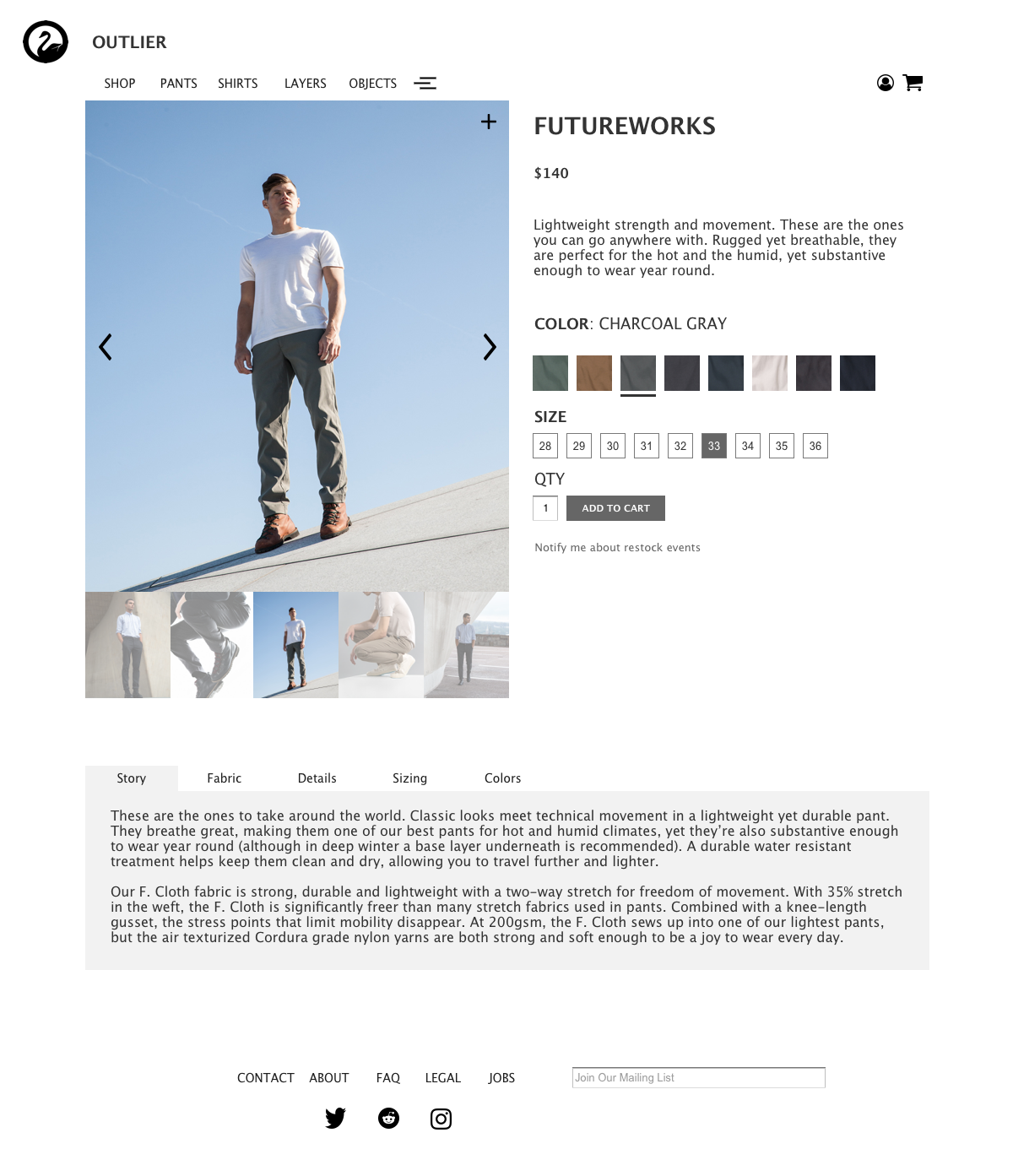
Outlier lacks a responsive website making the viewing experience difficult when switching between devices. In order to come up with a responsive site certain elements of the pages needed to be redesigned. Two primary pages of Outlier’s webpage were addressed in designing a responsive website, the home page and product pages.
Initial Sketch and First Iteration
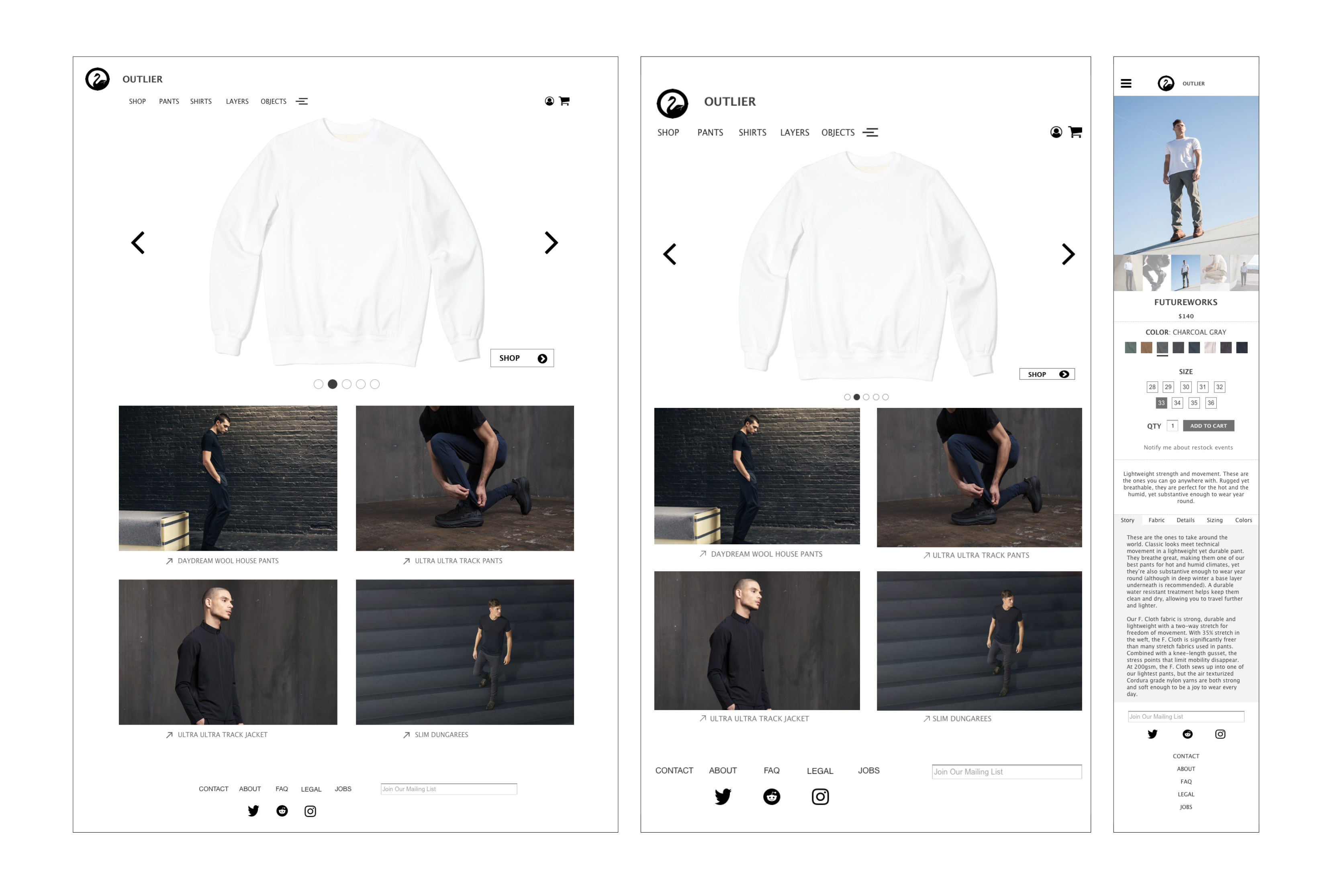
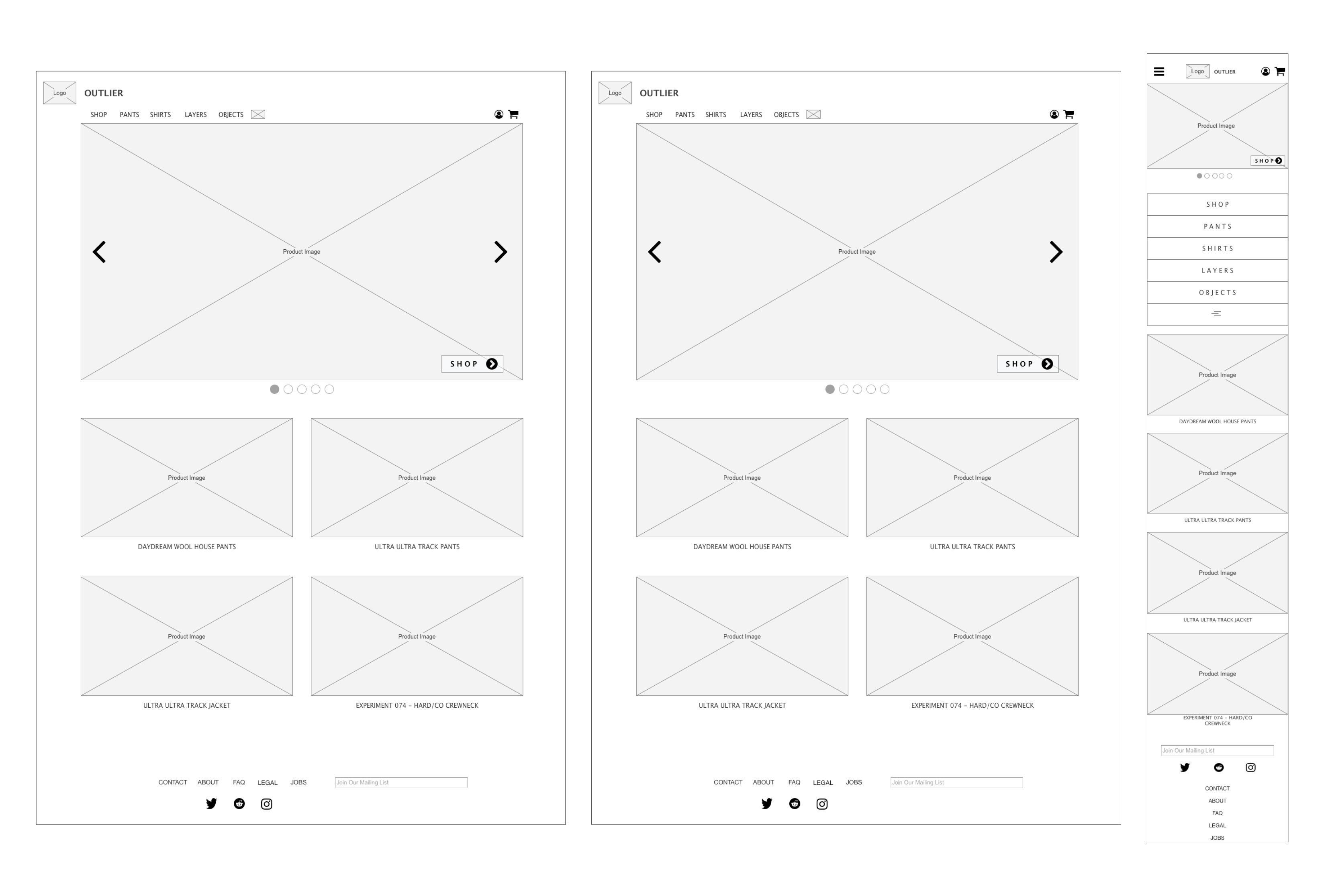
To redesign the homepage, I started by sketching out the potential page. The Sketch removes the use of large images and instead uses an image carousel to highlight new products. Below the image carousel, products that are back in stock or recently added are showcased in a more condensed manner. The Info link items consist of contact, about, faq, legal, jobs, mailing list sign up, and social media links. The cart link was removed and put in its place is a shopping cart icon for easier association. The account icon was added as users had to initially select the Info link in order to sign in. The experimental icon was moved next to the objects link for more consistency with navigation.
Sketches
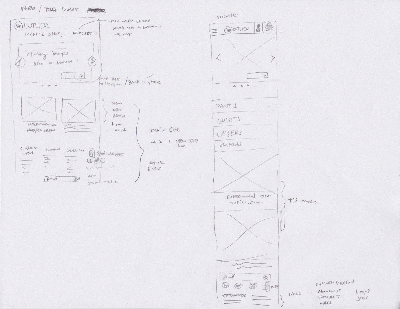
Initial Web | Tablet | Mobile
Second Iteration
The second iteration of the wireframes simply consisted of simply adding images to the homepage, tablet and mobile device for a more polished look.
Revised Web | Tablet | Mobile

Mobile Application
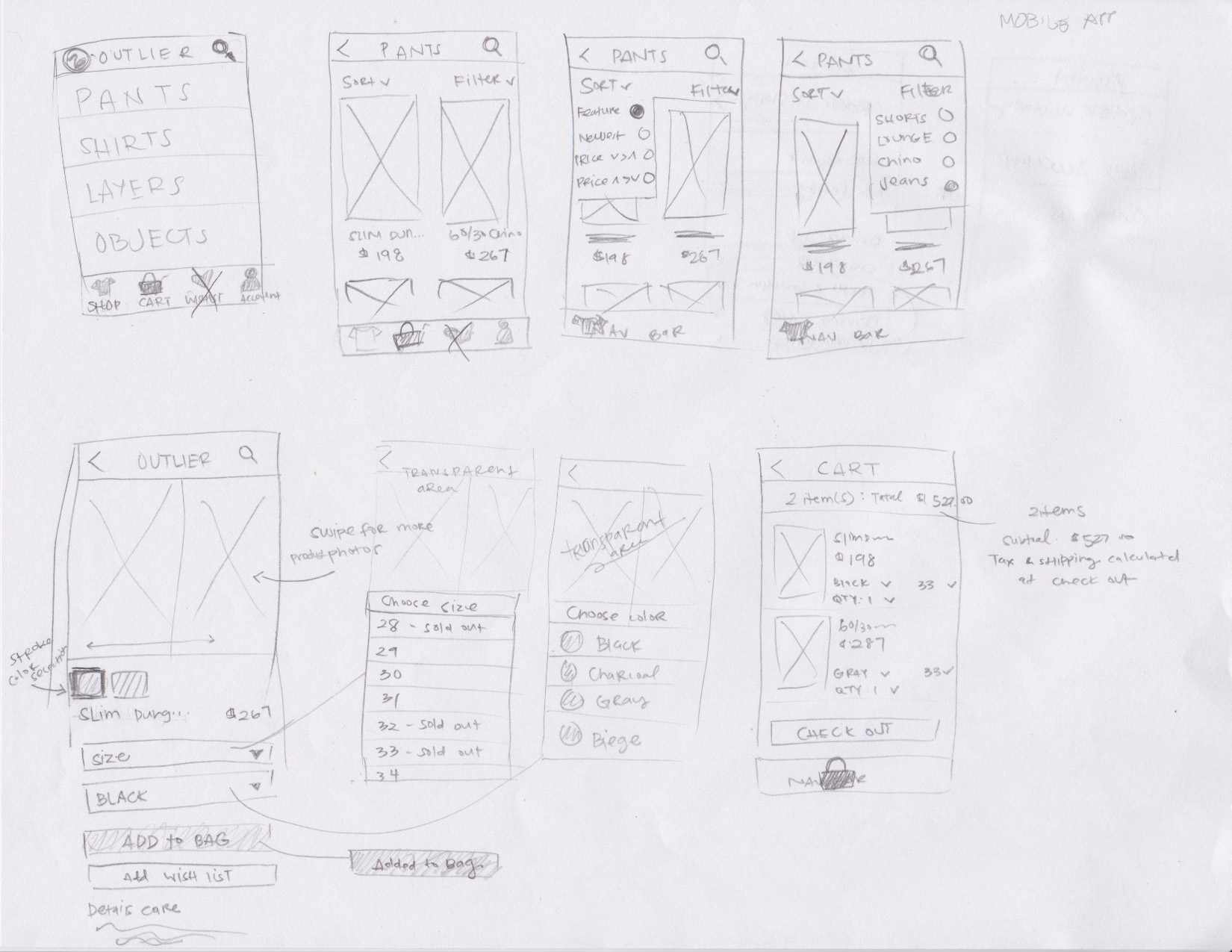
Currently Outlier does not have a mobile application. The mobile application will serve as a way for new and existing customers to interact with the company on the go. More importantly the mobile application will help customers place orders immediately. The application started with an initial process flow and sketch followed by two iterations of the prototype.
Process Flow

Sketches
First and Second Iteration
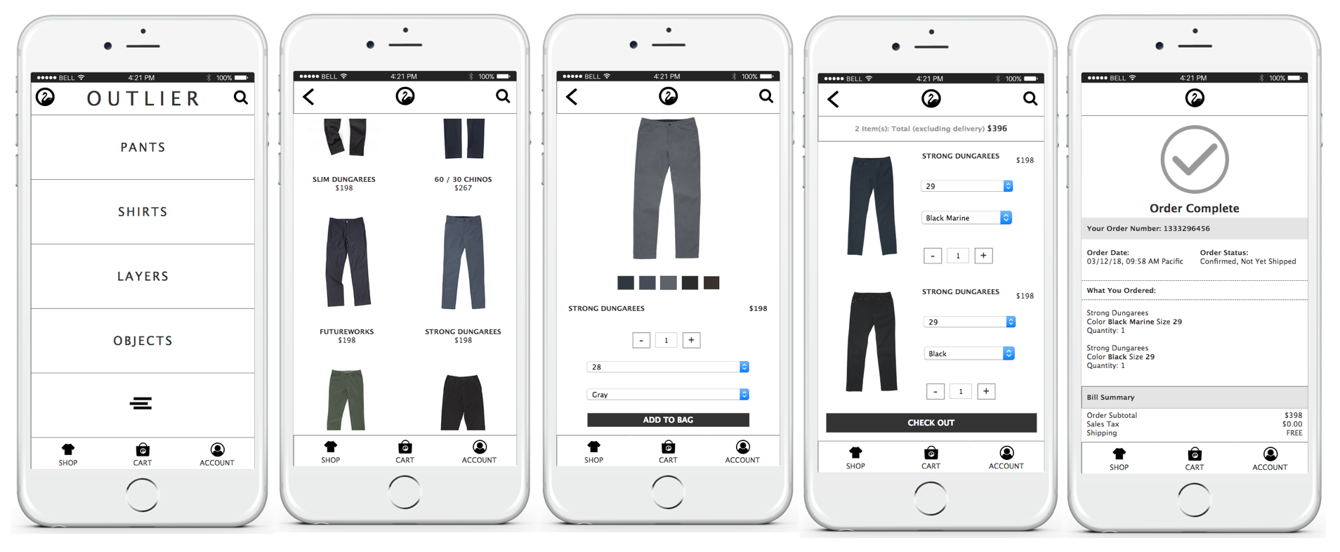
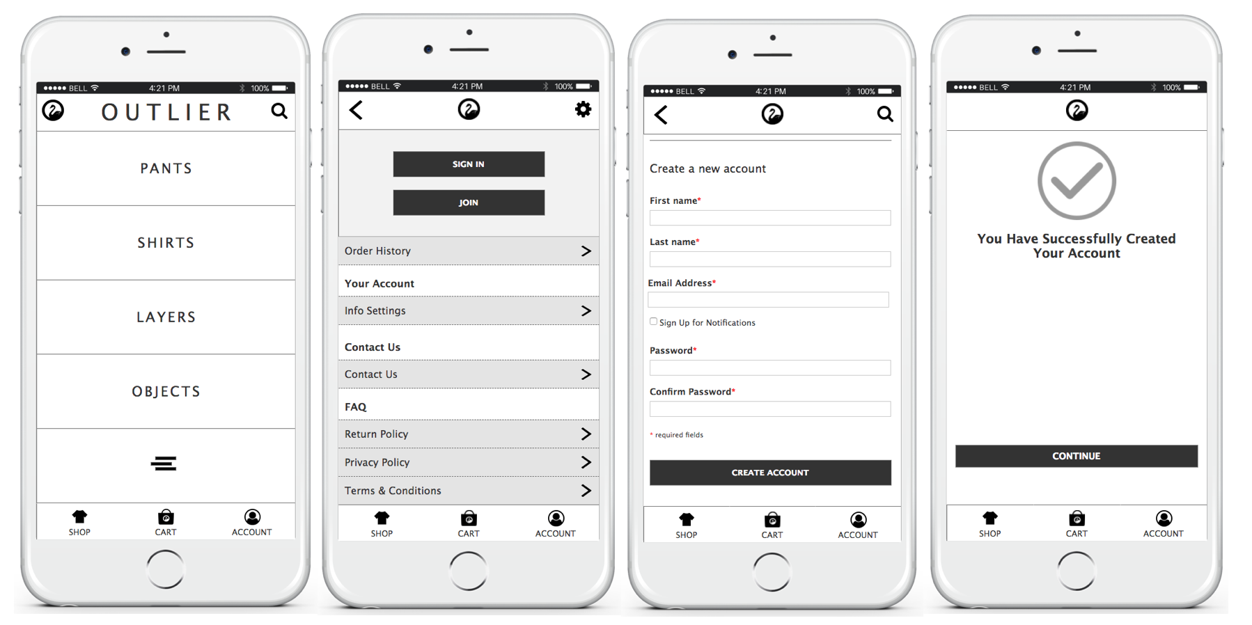
The initial prototype was built to capture two scenarios. The two scenarios were creating an account and purchasing an item. Creating an account was chosen because it allows for users to quickly add items to their cart and check out which is important particularly during Outlier’s weekly clothing drops. The second scenario of checking out is important because Outlier wants the process to be as simple as possible in order to make a profit but the process is important to the user because they want to be able to purchase items as quickly as possible. The second iteration of the prototype simply added photos of the products to the prototype for a more polished look.
Mobile Application Account Creation
Mobile Application Checkout Process

Brought to Life
